
Tech's Counter-Punch
How Apple's mega-rally and renewed rate cut hopes invalidated the bearish case for the Nasdaq, leaving other indices behind.

Last week’s bearish weekly setup, which suggested potential downside, gave way to a bullish reversal this past week. The move was strong enough to invalidate the bearish structures in the tech-heavy NDX. However, this bullish confirmation is not yet as clear for the broader SPX, and even less so for the Dow Jones Industrials (DJI) and small-caps (IWM), which continue to lag.
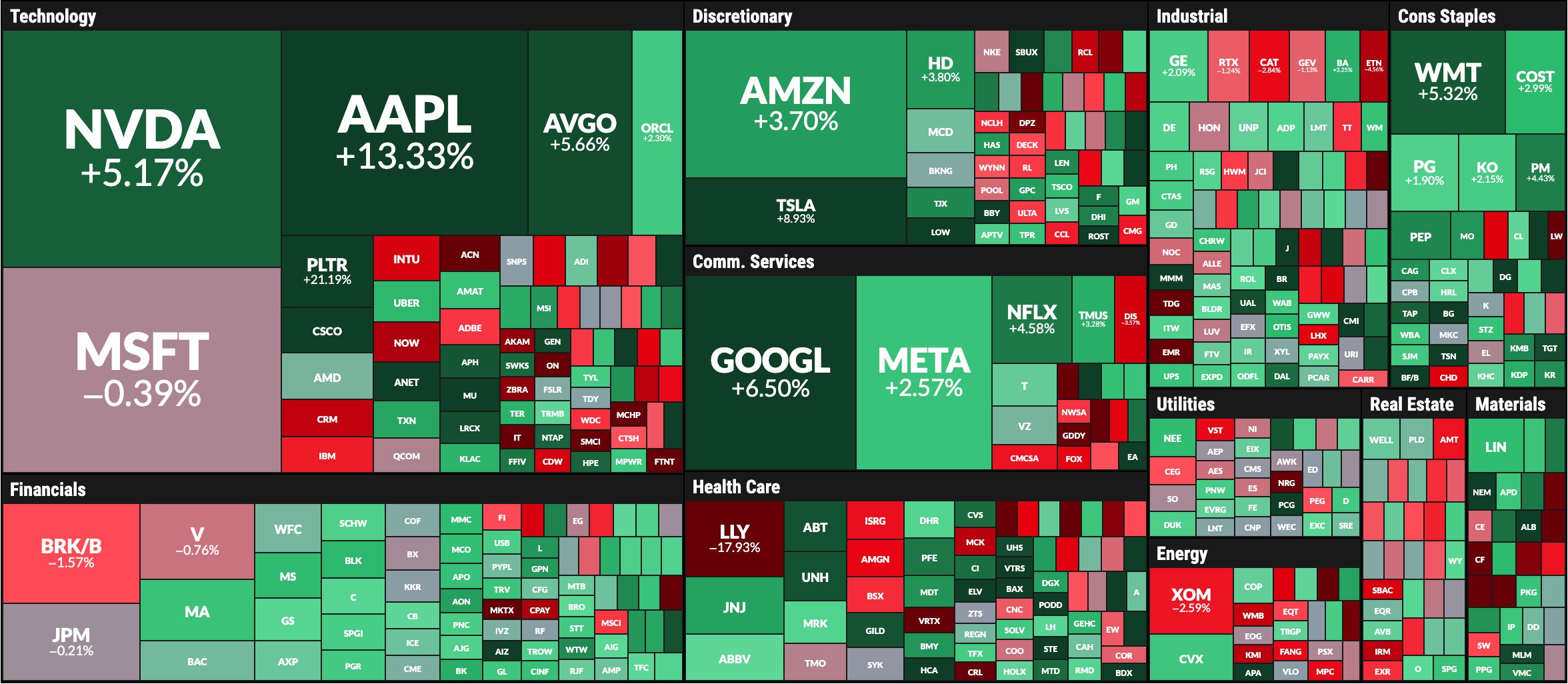
The week's upward thrust was not a broad-based advance but rather a concentrated rally driven decisively by the technology sector, fueled by significant company-specific news and a favorable macroeconomic backdrop.
Leading the pack was Apple (AAPL), which exploded with a +13.3% gain, its biggest weekly percentage jump since 2020. This major breakout was ignited by the announcement that Apple would invest an additional $100 billion in the U.S., raising its total commitment to $600 billion over the next four years. A move of this magnitude in one of the market's largest components has the power to single-handedly fuel a broader rally.
Adding to the tech bullishness, NVIDIA (NVDA) posted a solid 5% gain for the week. The advance was fueled by news that the U.S. government has authorized the company to resume sales of its H20 AI chips to China. This decision allows NVIDIA to re-engage with a critical market while navigating complex export controls, providing a significant boost to its outlook.
Other tech giants added gains during the week as follows in this weekly heat map for the SPX components:
Underpinning the rally is the broader market narrative, which is increasingly discounting future Federal Reserve rate cuts. Bond market pricing now reflects expectations of the federal funds rate declining to around 3% by the end of 2026, with some financial institutions anticipating as many as four rate cuts. This dovish outlook on monetary policy is providing a supportive environment for risk assets.
Pullback Cancelled?
Given the three main drivers that propelled the stock market this week—two of which were unexpected positive news from Apple and NVIDIA—we will now analyze the current technical setups and key seasonal factors.
As mentioned yesterday, in the Support and Resistance levels edition (click here), these levels are the best tool for managing sudden market moves. Every chart presented today includes the central weekly level that distinguishes between bullish and bearish scenarios.
Today's analysis covers: SPX, VIX, Breadth Indicators, NDX, DJI, SMH, IWM, GLD, SLV, TLT, BRK.B, PLTR, NFLX, GOOG, AAPL, TSLA, NVDA, META, AMZN, MSFT, and BITCOIN. A Special seasonality analysis is included for the SP500.
Why analyzing that amount of securities every single week?
The Relative Rotation Graph below illustrates the diverse menu of technical setups available within this universe of securities. These setups range from bullish reversals (as previously highlighted for AAPL) and consolidations (currently seen in MSFT and anticipated for weeks in NFLX, GLD, and Bitcoin) to clear bullish momentum (as seen with META) and pullbacks or weak conditions (as with BRK.B).
Each security is at a different stage in its cycle. By consistently presenting these varied setups, my purpose is to help you make educated decisions using a set of stocks backed by well-studied technical patterns and fundamental analysis.
Don’t miss the fundamental update posted last Wednesday for META, MSFT, AAPL, and GOOG; and more updates are coming this Wednesday for AMZN, TSLA, and PLTR.

Moves in the securities technically analyzed at SmartReversal’s Trading Compass during the last 10 weeks:
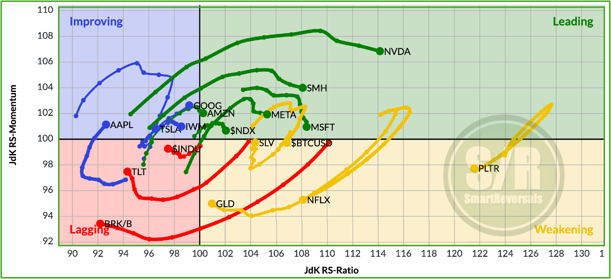
The chart visualizes the relative strength and momentum of multiple securities in comparison to the SPX and to each other. Essentially, it helps investors see "the big picture in one picture" by plotting assets on a four-quadrant graph.
The graph's power lies in its ability to show how different assets and where they might be headed next. Each asset on the graph has a "tail" that shows its historical path (10 weeks in this case), making it easy to see the direction and speed of its rotation.
The chart is built on two key metrics:
JdK RS-Ratio (X-axis): This measures the trend of relative strength. A value over 100 indicates an uptrend in relative performance against the benchmark.
JdK RS-Momentum (Y-axis): This measures the momentum (or rate of change) of the RS-Ratio. It acts as a leading indicator for the RS-Ratio itself.
These two metrics place each security into one of four quadrants, each telling a different story about its performance cycle. Typically, securities will rotate in a clockwise direction through these quadrants, and the technical analysis provided every week helps to anticipate the moves.
Securities don’t always follow a perfect clockwise rotation. A leading asset can dip into the Weakening quadrant before returning to leading (e.g., PLTR, and potentially Bitcoin, GLD, and NFLX), just as an Improving asset can fail to progress and fall back into the Lagging quadrant (potentially TSLA). The four quadrants are:
Leading (Top-Right): 🟢 Securities in this quadrant are strong and getting stronger. They have high relative strength and positive momentum, meaning they are outperforming the benchmark and the trend is accelerating. These are often considered top performers.
Weakening (Bottom-Right): 🟡 Assets here still have high relative strength (outperforming the benchmark) but are losing momentum. This can be an early warning sign that their period of leadership might be coming to an end.
Lagging (Bottom-Left): 🔴 These are the underperformers. They have low relative strength and negative momentum, indicating they are in a relative downtrend against the benchmark.
Improving (Top-Left): 🔵 Securities in this quadrant have low relative strength but their momentum is picking up. These could be potential turnaround candidates that may be heading towards the Leading quadrant.
This approach can be used for assets rotation in a portfolio, stock selection, and also risk management, by spotting securities that are moving into the Weakening or Lagging quadrants,
Can Berkshire bounce like Apple? Will NVIDIA slip into the Weakening quadrant? Does TLT have the momentum to keep improving? Can Bitcoin reclaim its spot in Leading? Today, as usual, we will study the technical setups for each of these key securities.
Let’s begin with a seasonality chart for the SPX
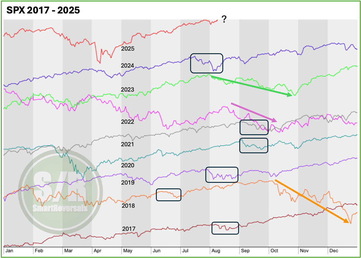
When the market moves unexpectedly, my approach is not to fight the trend but to deepen my analysis. Today, I'll focus on seasonality.
Based on historical SPX data, here are the key considerations: