QQQ Case Study - Decoding Price Action
The Essential Guide for Technical Analysis - eBook Included
This marks the end of my second end of a year publishing on Substack (also accessible via SmartReversals.com). The feedback from subscribers has been overwhelmingly positive, and I want to thank you sincerely for being part of this community.
This article is a token of gratitude for everyone; free and paid subscribers alike. It is designed to share critical knowledge about technical analysis, especially for those who have recently entered the stock or crypto markets.
Boosting Investment Performance with Technical Analysis
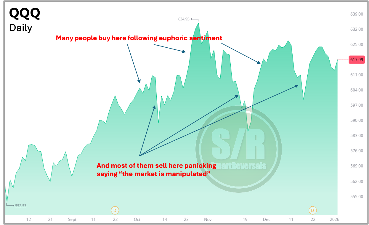
Market cycles often trap new investors, euphoria draws them in after prices have already rallied, forcing them to endure painful consolidations or sell near the bottom. We saw this recently with Crypto following the Q2 2025 rally; many hesitated initially, only to buy near the highs in June or July. A similar pattern played out in the stock market during the April-June 2025 bounce when apathy dominated the mainstream news and social media. Technical analysis helps you break this cycle by assessing price action neutrally, filtering out the noise out there.
Through disciplined analysis, this publication identified bullish signals for the stock market in April 2025 when the market was panicking, bearish signals for Crypto in early October 2025 when there was Crypto-Euphoria, and is currently flagging warning signs in metals. Conversely, just last week we identified bullish setups for Bitcoin, Ethereum, and related assets like MSTR, all of them rallied today 🎯🎯🎯.
Some people are only bullish or only bearish, I’m market neutral, paid subscribers know my bearish position toward AAPL, which was called three weeks ago and reinforced last week, today the stock continued declining 🎯 (I called also the bounce for AAPL in July 2025 when it was a laggard).
Today, I will demonstrate how technical analysis works using QQQ, the ETF for Nasdaq100 (NDX) as a case study, showing you how essential indicators help anticipate reversals.
As a final ‘thank you,’ you will find my eBook, Technical Analysis Essentials, at the end of this post. This edition includes the foundational Volume Chapter and the SPX case study, completing the seven chapters.
To allow more people to access this information, please spread the word. Tap the Like button 💚 (even if you're reading this in an email) and consider sharing it with a friend.
Let’s begin.
QQQ: Using Technicals to Master Price Action Navigation
This guide presents the most important indicators that every market participant should know in order to navigate price movements with greater confidence and consistency.
By moving beyond simple chart visuals, investors gain access to a deeper layer of market insight. Technical indicators help reveal market structure, confirm trends, and validate entry and exit points with much greater precision, transforming uncertainty into informed decision making.
The “Naked” Chart vs. What the Market Is Really Saying
The learning process begins with the most basic chart representation: the area or line chart. As shown in the first slide, this type of chart offers very limited practical value. While it illustrates price direction, it lacks critical context it does not identify overbought or oversold conditions, clarify price action behavior, or highlight key support and resistance zones where price reactions often occur.
Relying exclusively on a naked chart is like driving with no clear view of the road ahead. You may recognize where you have been, but without proper visibility, anticipating turns, risks, or opportunities becomes nearly impossible.
Candlesticks: Understanding Market Sentiment
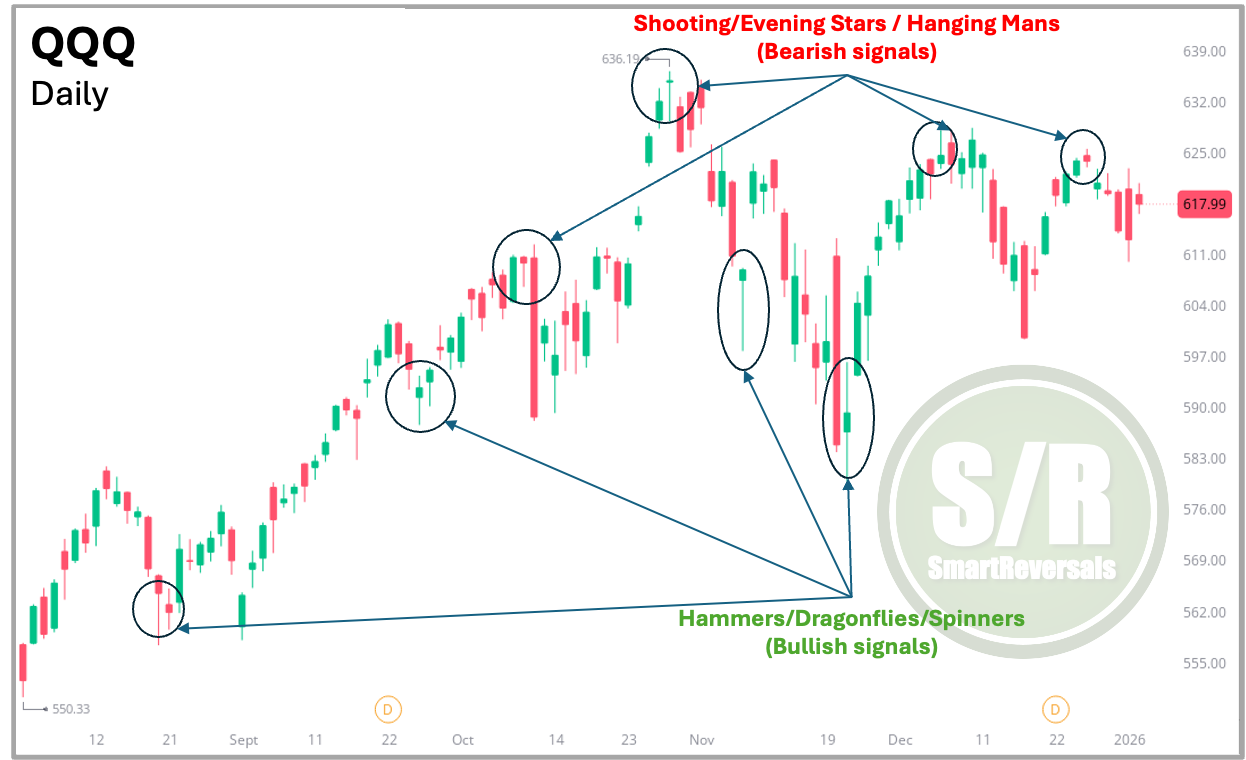
To truly understand market sentiment and identify potential reversal points, traders and investors need to move beyond basic charts and adopt candlestick analysis. Unlike simple line charts, candlesticks provide a rich visual narrative of the ongoing struggle between buyers and sellers within each time frame. Every candle captures not just direction, but also intent, pressure, and momentum.
As illustrated in the chart below, recognizable formations such as Shooting Stars, Hangin Mans, which signal bearish pressure and Hammers, which indicate bullish strength, can help anticipate reversals well before they develop into clear market trends. Learning to identify these patterns enables traders to detect signs of exhaustion during an upward move or emerging strength during a market decline, giving them a valuable edge in decision-making.
Moving Averages: Evaluating Trend Strength
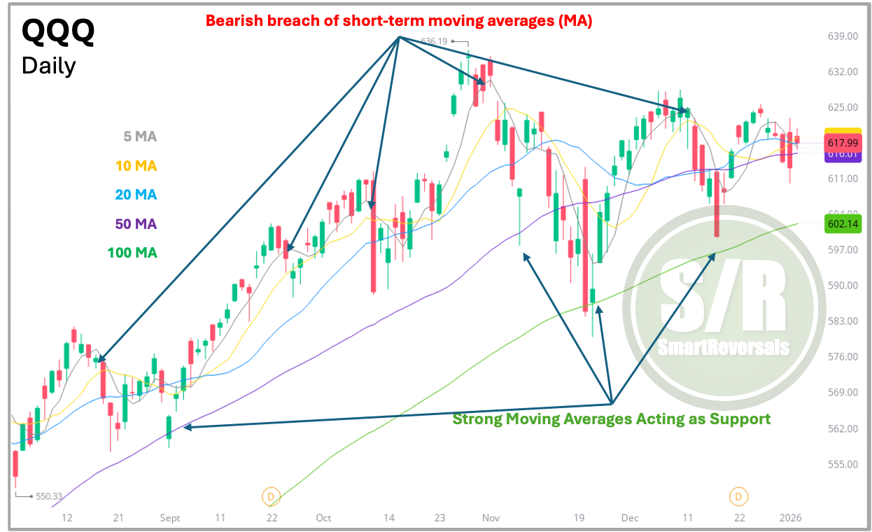
Once traders are able to interpret price action, the next step is to evaluate the strength and stability of the trend using Moving Averages (MA). As demonstrated in the third chart, combining short-term averages (5 and 10 MA) with medium- and long-term averages (20, 50, and 100 MA) provides a more complete and dynamic perspective of market behavior, helping traders understand how price interacts with the trend.
A break below a short-term Moving Average often indicates a loss of short-term momentum, while a failure to hold longer-term averages (such as the 50 or 100 MA, not to mention the 200 MA) can signal a deeper shift in the overall trend structure. These longer-term levels are especially important, as they reflect broader market conviction.
The chart below highlights the importance of losing the 5 and 10 MA in the case of QQQ. For some traders and investors, a break below these averages may be interpreted as a potential sell signal, while a recovery above them may suggest a buy opportunity. This is not presented as a strict rule, but rather as an example of how having clear criteria can improve Moving Average analysis and support more disciplined decision-making.
Bollinger Bands: Understanding Price Extremes and Volatility
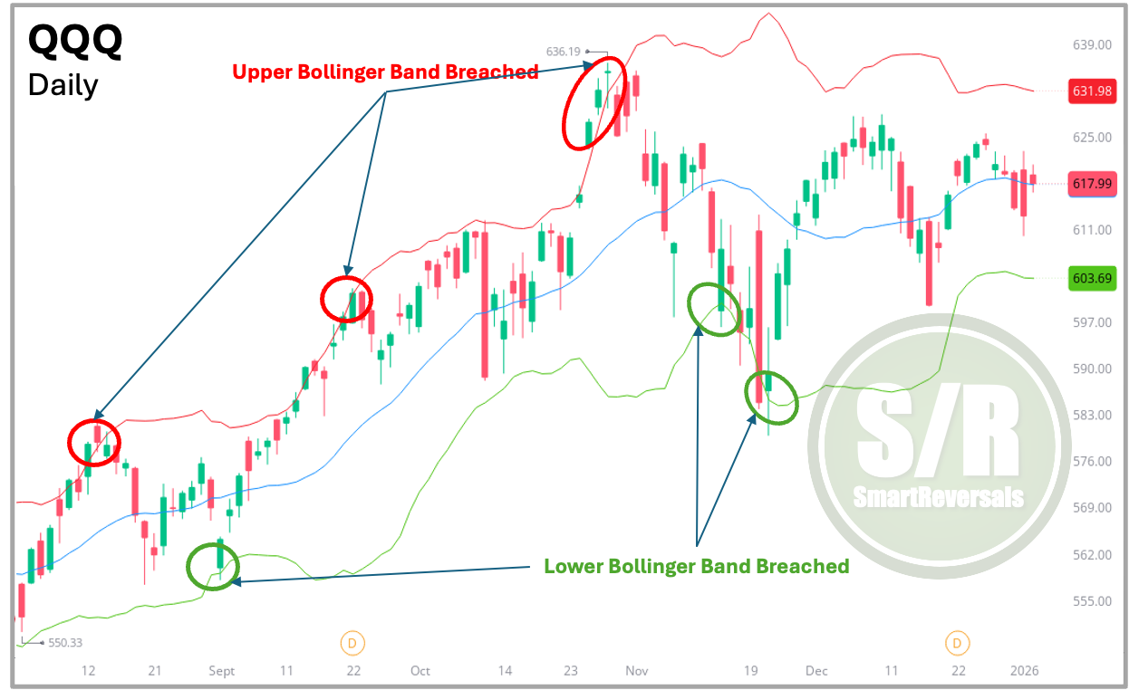
To gain a more precise perspective on market behavior, Bollinger Bands play a fundamental role in evaluating volatility and detecting extreme price conditions. As illustrated in the fourth chart, most price movements naturally fluctuate within the upper and lower bands, which serve as boundaries for normal market activity.
When price moves beyond the Upper Bollinger Band, it often reflects excessive bullish pressure, suggesting the asset may be trading above its typical value range. In contrast, a move toward or below the Lower Bollinger Band can signal heightened selling pressure, pointing to a potentially oversold or undervalued asset. This indicator is particularly effective for identifying mean reversion setups, where price has a higher probability of returning toward its average after deviating too far from its normal range.
Oscillators: Mastering Momentum Timing
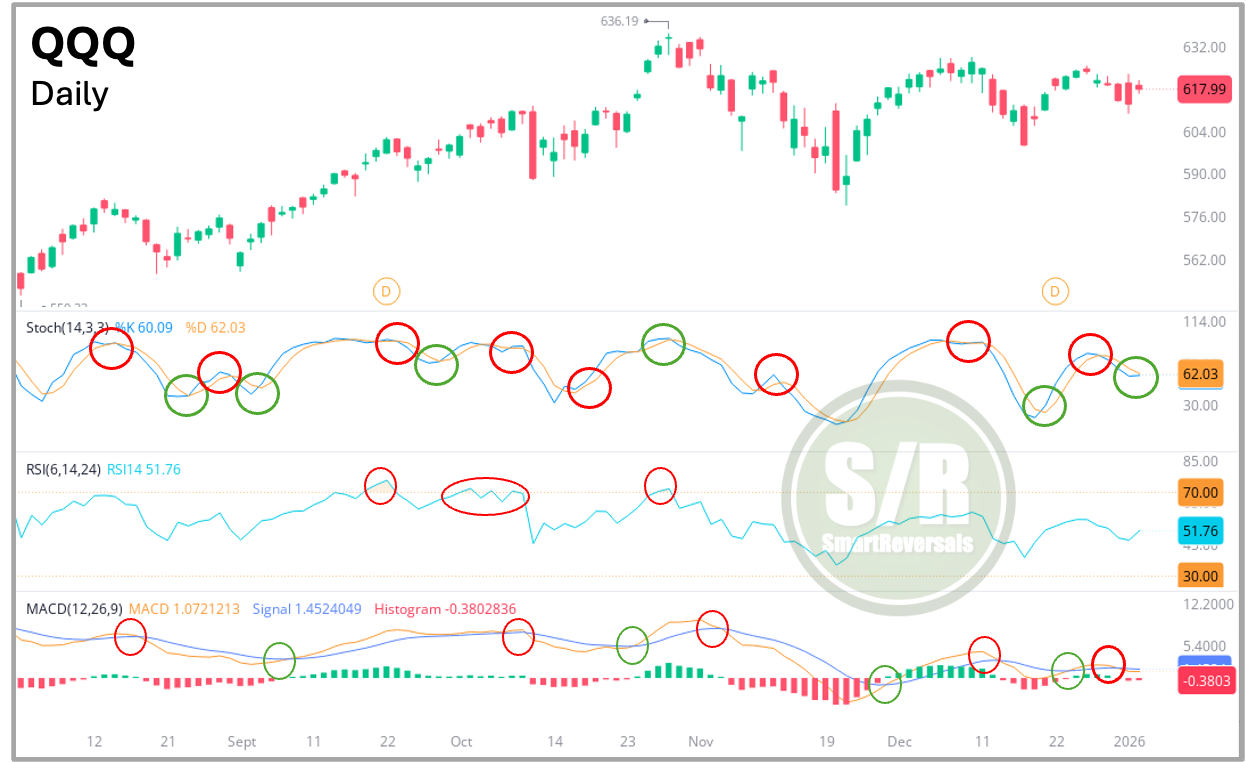
To effectively confirm price movements and assess momentum, traders rely on oscillators such as the Stochastic, RSI, and MACD. Before analyzing the chart itself, it is essential to clarify two foundational concepts that guide oscillator-based decision-making.
An overbought condition occurs when price has advanced aggressively in a short period of time, often signaling that buying pressure is losing strength and a corrective move may follow. An oversold condition, on the other hand, appears when price has declined sharply, indicating that selling pressure may be exhausted and a rebound becomes increasingly likely.
In the fifth chart, both the Stochastic and RSI are used to identify these extreme conditions, helping traders pinpoint more precise entry and exit opportunities. Meanwhile, the MACD histogram plays a key role in confirming a reversal and a shift in momentum (it works more like a validation, while the others can work better to assess tops and bottoms).
Each oscillator behaves differently and should be interpreted accordingly. The Stochastic responds more quickly to price changes; in weaker market environments, overbought signals may disappear rapidly, while in strong trending markets, the indicator can remain in overbought territory for extended periods. Typically, readings above 80 indicate overbought conditions, while levels below 20 suggest oversold conditions. Crossovers between the Stochastic lines often serve as early warnings of potential reversals.
The RSI, by contrast, moves at a slower pace and therefore provides more conservative signals. When the RSI reaches or exceeds 70, it reflects a clearly overextended price move, while readings below 30 indicate a strongly oversold market.
The MACD operates at a much slower pace compared to other oscillators, which makes its signals especially meaningful when its lines intersect, as illustrated in the chart. These crossovers often provide stronger confirmation of momentum shifts rather than early, reactive signals.
You began by observing simple line or area charts, and now you have been introduced to a range of technical indicators that add depth and clarity to market analysis. While this is only a starting point and there is much more to explore, you can continue developing these skills by subscribing to the Weekly Compass. Each week, more than 30 securities are carefully analyzed, with priority given to the most compelling setups. This includes clearly defined key price levels, highlighting where momentum must be maintained or where a break is required to confirm a meaningful trend reversal.
Central Level (Support and Resistance): Defining the Market’s Directional Threshold
To simplify the decision-making process, I rely on clearly defined price zones known as Central Levels. As illustrated in the sixth chart, these horizontal reference points act as a directional filter for traders: as long as price remains above the Central Level, the market bias is considered bullish; when price moves below it, the bias shifts to bearish. This straightforward yet highly effective approach eliminates uncertainty by establishing clear “line in the sand” levels, allowing traders to define risk and expectations without speculating about potential support or resistance.
Every Friday, I publish both the Central Weekly and Central Monthly Levels for the upcoming week and month across U.S. indices, megacap stocks, futures, metals, and cryptocurrencies. For nearly two years, premium subscribers have experienced the effectiveness of these modeled levels, which consistently highlight critical price zones. When viewed in hindsight, these levels clearly demonstrate their importance in confirming momentum shifts and validating market reversals.
Continuing with the QQQ case study, the Central Monthly Level (CML) demonstrates its relevance once price action breaches that level like in November, following the appearance of a hanging man type candlestick above the Bollinger Band days before, combined with an overbought RSI, and a bearish Stochastic crossover.
Central Weekly Level - The Ultimate Filter
As a final refinement, rather than waiting for the loss of the Central Monthly Level (CML) or a breakdown of the 10 or 20 Moving Averages, I rely on the Central Weekly Level (CWL). This level is updated every Friday for the week ahead and provides subscribers with a precise reference point to evaluate short-term price behavior. The CWL helps confirm whether a pullback is developing, particularly when price is overbought and subsequently moves below this level, or whether a bounce is gaining traction, as illustrated in the QQQ example shown below
Together, the Central Monthly Level (CML) and Central Weekly Level (CWL) form essential tools for assessing momentum and validating trade setups across higher timeframes. As long as price remains above its CWL and CML, the broader momentum stays constructive, and pullbacks are generally considered buying opportunities. Conversely, when these levels fail, the market structure is compromised, helping traders avoid staying trapped in losing positions.
Price Levels must always be used with technical indicators, expecting for a reversal when price action is showing conviction and the price is not oversold or overbought, may end in trying to catch a falling knife (for longs/bulls) or getting squeezed a strong rally (for shorts/bears).
Conclusion
Understanding which indicator to apply, and when, is crucial for consistent investment success. SmartReversals streamlines this process for you by identifying the most relevant indicators for each security and setting precise price targets and stop-loss references using the right Support and Resistance levels.
This rigorous approach consistently proves its value to our premium subscribers. I conduct this deep analysis across many securities, selecting only the strongest setups. This is how our High-Probability Setups are posted every weekend. For example, the bullish expectations for Dow Jones, JPM, Bitcoin, Ethereum, IBIT, and MSTR played out successfully, while my bearish view on AAPL was validated again by today’s drop.
Transparency: Two bearish setups were temporarily invalidated today but the capital is protected given the specific price levels provided as references to set stops. One of those setups was SLV; the Weekly Compass has made the case of how risky is to chase with longs at the current structure and if so, how to do it.
This publication provides consistent analysis for numerous securities, but most importantly, the better setups are highlighted for you weekly. Our cumulative accuracy rate currently stands at 76% (Experienced Traders know that a success ratio above 65% or 2:1 is more than outstanding).
Subscribe today and unlock all the setups every week, along with clear illustrations explaining the strength of each one. One high probability setup pays for the whole subscription!.
Recent Publications Worth Unlocking with Paid Subscription:
Latest Weekly Compass with High Probability Setups for this Week:
Support and Resistance Levels for 40+ Securities:
Price Targets for SPX and NDX in 2026:
And free for you today my eBook:
Did you like this content? Like and Repost for another free publication analyzing TSLA and Bitcoin!
The content provided on SmartReveals.com is for educational and informational purposes only. All analyses, research, commentary, and other materials are intended to help users understand financial markets, investment concepts, and company fundamentals. This content does not constitute investment or any type of advice. The support and resistance levels are modeled references to manage risk and anticipate potential reversals, each investor must assess their own risk tolerance to set stops.
My only communication channel with you is via email, and the Substack chat, I don’t use Telegram, WhatsApp, Discord, Private Channels, or any other communication method.




Excellent content, thanks for the complete eBook.