In investing, relying on headlines or hunches is a fast track to losses. To succeed, you must replace subjective opinions with objective data. This edition focuses on the critical technical indicators that strip away the noise and reveal the true state of the market. We are moving beyond simple charts to help you understand market structure and time your entries and exits with mathematical precision.
This is a special free edition designed to demonstrate the power of combining Technical Analysis with Support and Resistance Levels to free subscribers. Let’s dive in. If you decide to unlock the full paid content, which is already delivering results today, you can upgrade clicking here.
Note for Premium Subscribers: This is a bonus educational issue and does not replace your regularly scheduled exclusive content.
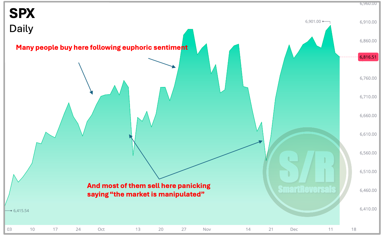
Why Simple Charts Aren’t Enough The first slide below illustrates the “naked” chart, a basic line graph. While it shows you the general direction, it fails to tell you the story behind the move. It misses the critical “when” and “where” of trading: Is the price extended? Are we hitting a concrete floor or ceiling?
To trade off this chart is to drive blind. It gives you perfect hindsight, allowing you to see the road you’ve traveled, but it leaves you completely exposed to obstacles and turns the moment they appear.
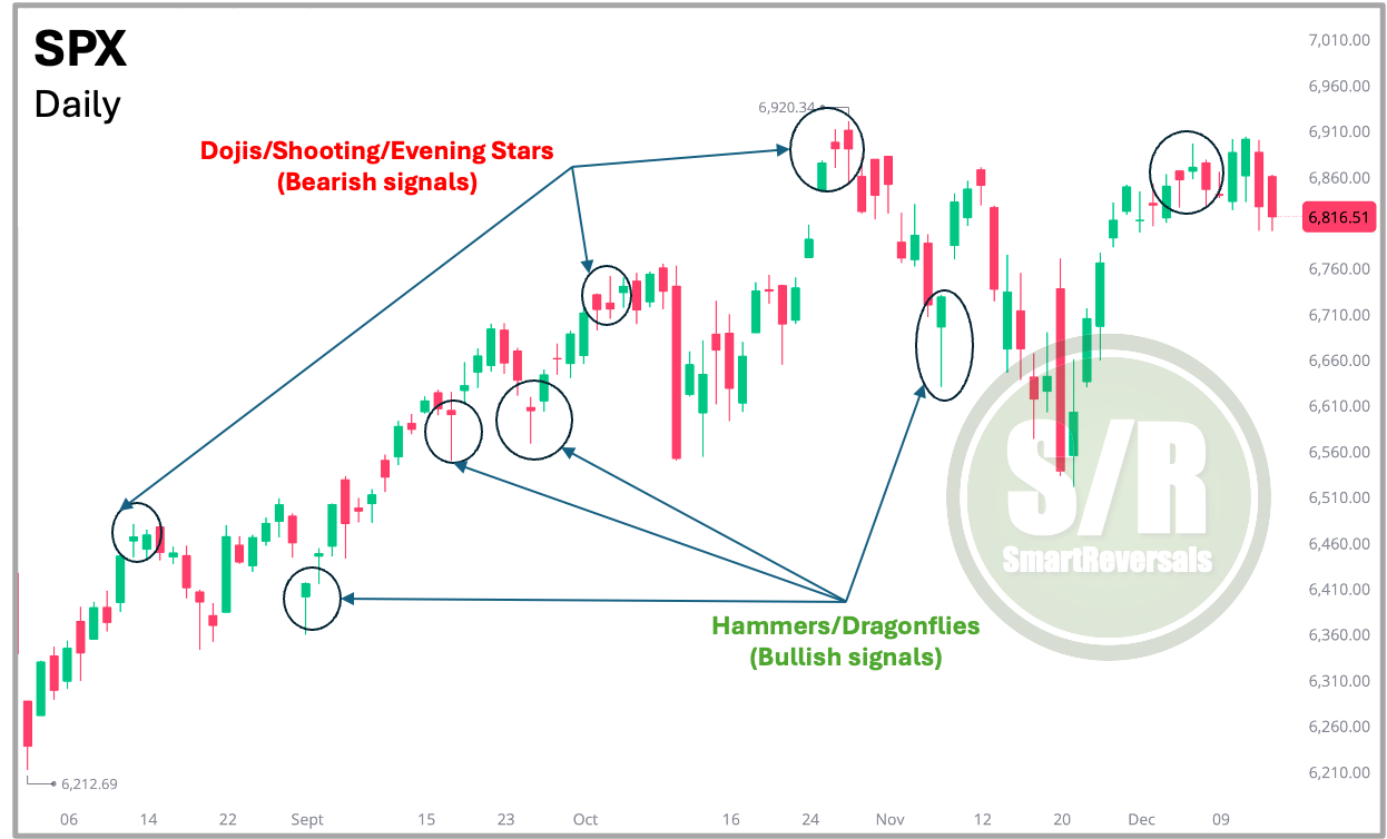
Candlesticks: Decoding Market Psychology To truly understand market sentiment, you must graduate from line charts to candlesticks. A line chart smooths over the details, but candlesticks reveal the tug of war between bulls and bears in every single session. As illustrated below, patterns like the “Shooting or Doji Star” (signaling a potential drop) or the “Hammer” (signaling a potential bounce) act as early warning systems. They allow you to spot the exact moment a trend gets tired or finds support, giving you the chance to react before a full reversal becomes obvious.
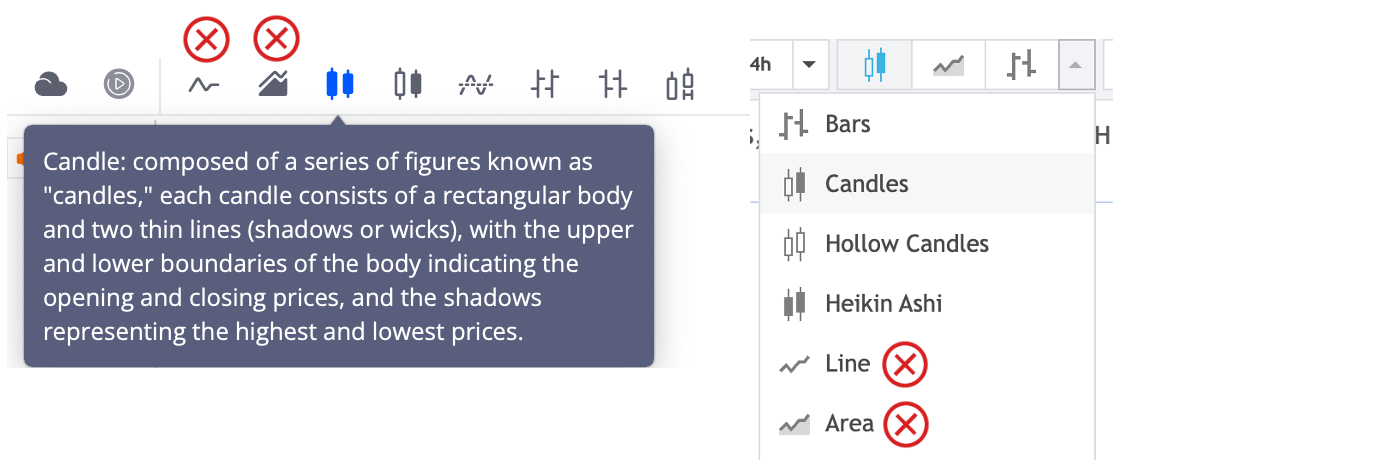
Candlesticks is a basic feature that most platforms have available, you just need to change the type of graph to candlesticks from area or line!
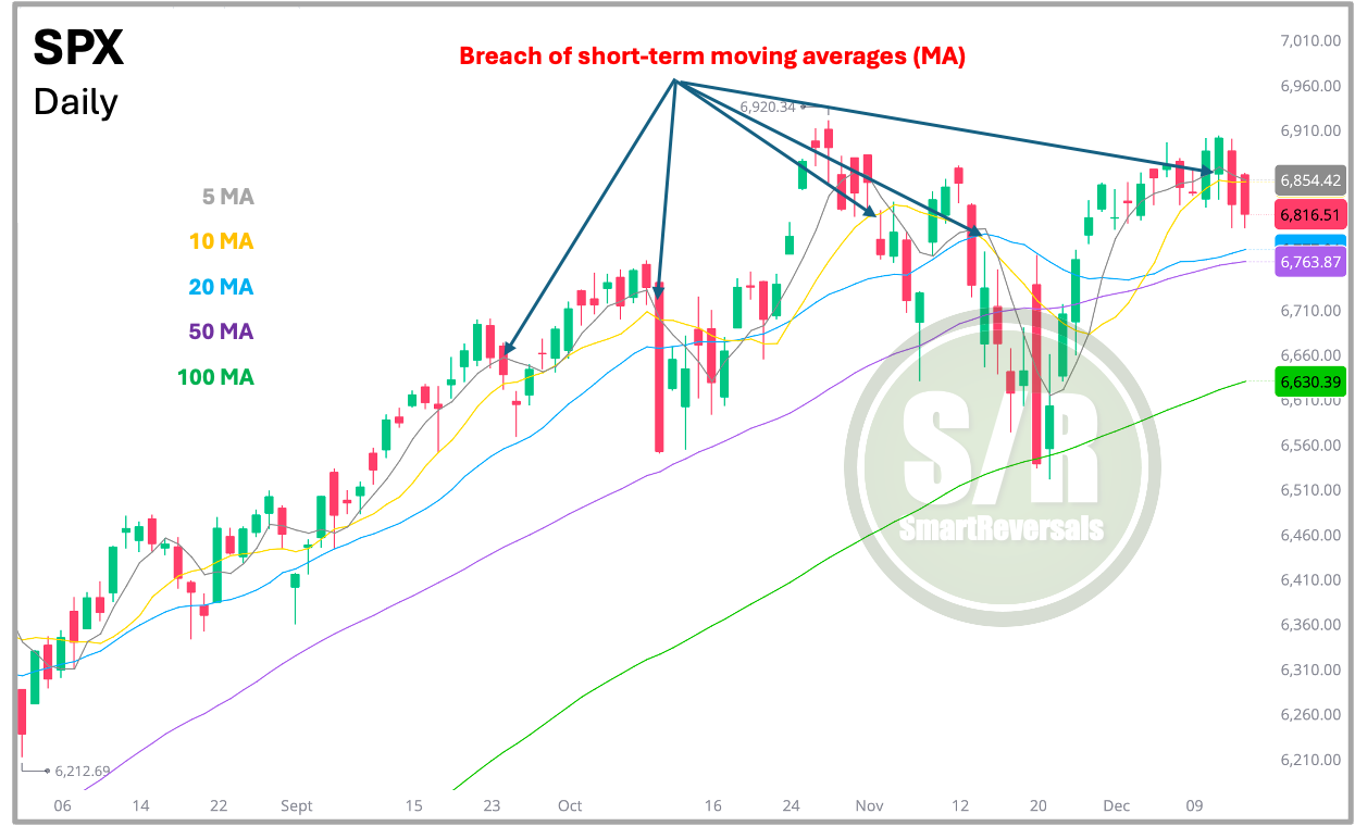
Defining Trend Structure with Moving Averages Price action tells you what is happening; Moving Averages tell you the context. By integrating short duration averages (5, 10) with major structural levels (20, 50, 100), you create a dynamic framework for the trend. These averages act as non-static support and resistance levels.
The interaction is key: losing a short-term MA indicates fading momentum, whereas violating a significant level like the 50 or 100 MA often signals a fundamental shift in market direction. See where the price bounced from three weeks ago (100DMA), and two months ago (the 50DMA).
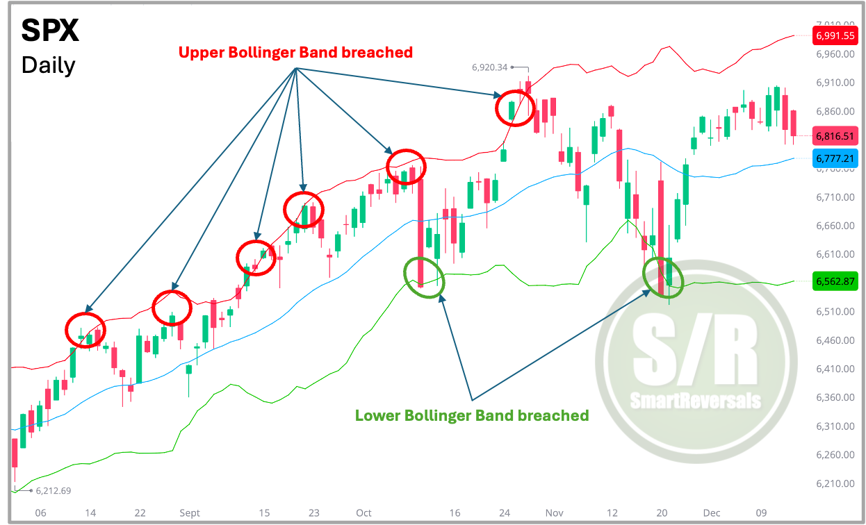
Bollinger Bands: The Boundaries of Price To gauge whether a move is sustainable, we add Bollinger Bands. These bands create a visual corridor based on volatility. As shown in the fourth chart, price rarely stays outside these limits for long.
Think of the bands as a rubber band: when price punches through the Upper Band, it is often stretched too far and considered “expensive.” A drop through the Lower Band suggests it is “cheap.” This makes the tool perfect for identifying mean reversion trades catching the moment the price snaps back to the center.
No indicator is perfect in isolation. To achieve precision, successful traders combine multiple indicators to fine-tune their analysis.
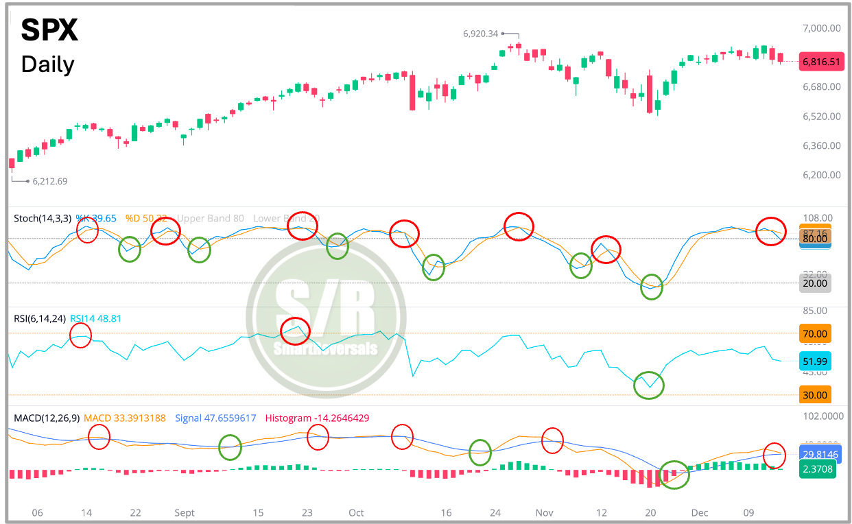
Oscillators: The Engine of Momentum To validate a setup, we look “under the hood” using oscillators like the Stochastic, RSI, and MACD. Before analyzing the charts, you must understand two market states:
Overbought: The price has moved up too quickly. Buyers are likely exhausted, and a pullback is probable.
Oversold: The price has dropped too sharply. Sellers are washed out, and a bounce is likely.
As shown in the chart below, these tools behave differently. The Stochastic is the “sprinter” it reacts fast. While readings above 80 (overbought) or below 20 (oversold) signal potential reversals, be aware that in strong trends, it can stay “pinned” in overbought territory. The RSI is the “marathon runner”, it moves slower and smooths out the noise. When RSI hits 70, the asset is significantly extended; below 30, it is heavily discounted. Finally, the MACD acts as a confirmation filter, helping you judge the strength of a trend or a reversal.
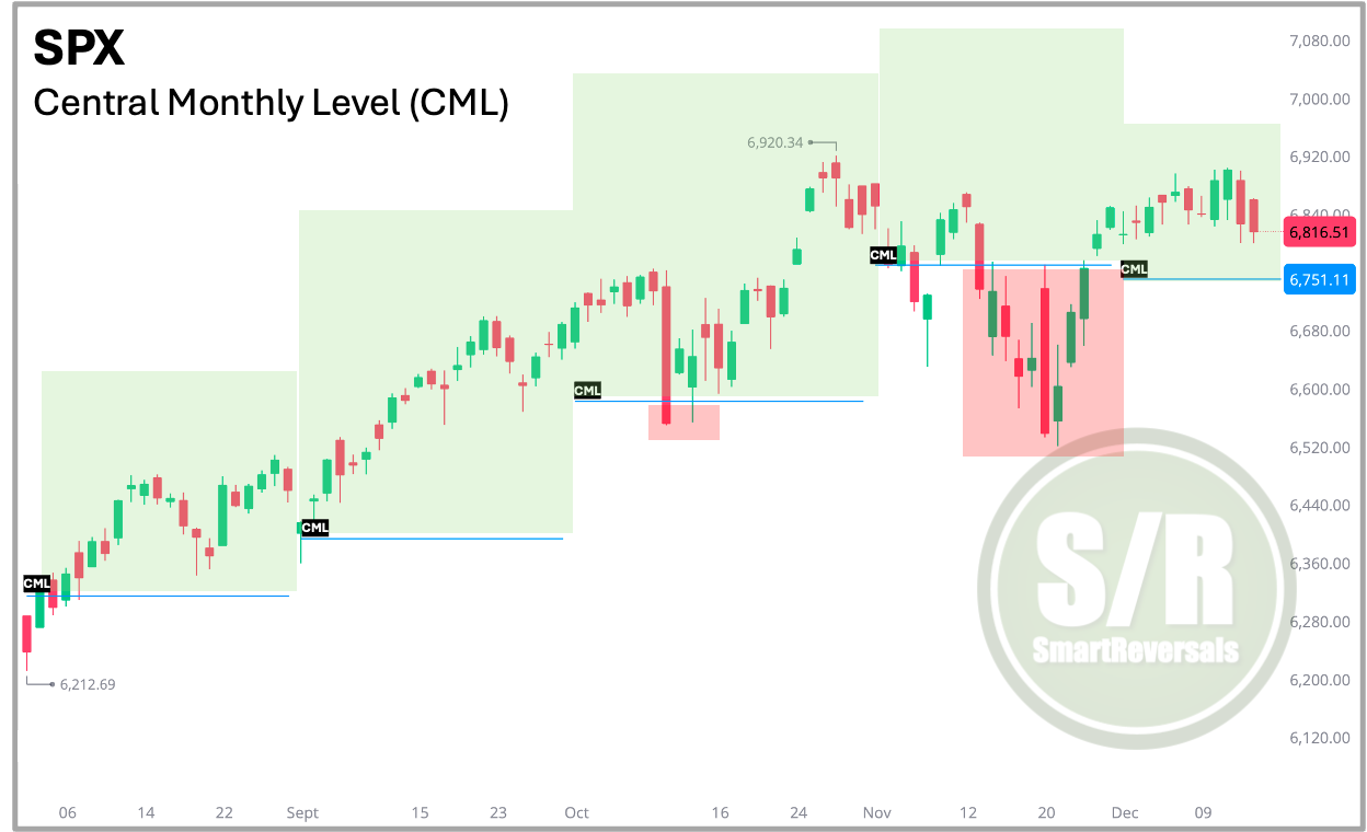
Support and Resistance Levels: Defining Bullish vs. Bearish To simplify complex price action, we use the “Central Level.” Think of this as a line in the sand. As illustrated in the sixth chart, it acts as a binary filter for market bias:
Price > Central Monthly Level = Usually Bullish
Price < Central Monthly Level = Usually Bearish
This removes the guesswork. Instead of wondering where the floor is, you have a concrete “make or break” boundary to define your risk. Every Friday, premium subscribers receive these Weekly and Monthly levels for Indices, Megacaps, Metals, and Crypto. For nearly two years, these modeled lines have proven essential for validating major reversals and momentum shifts with precision.
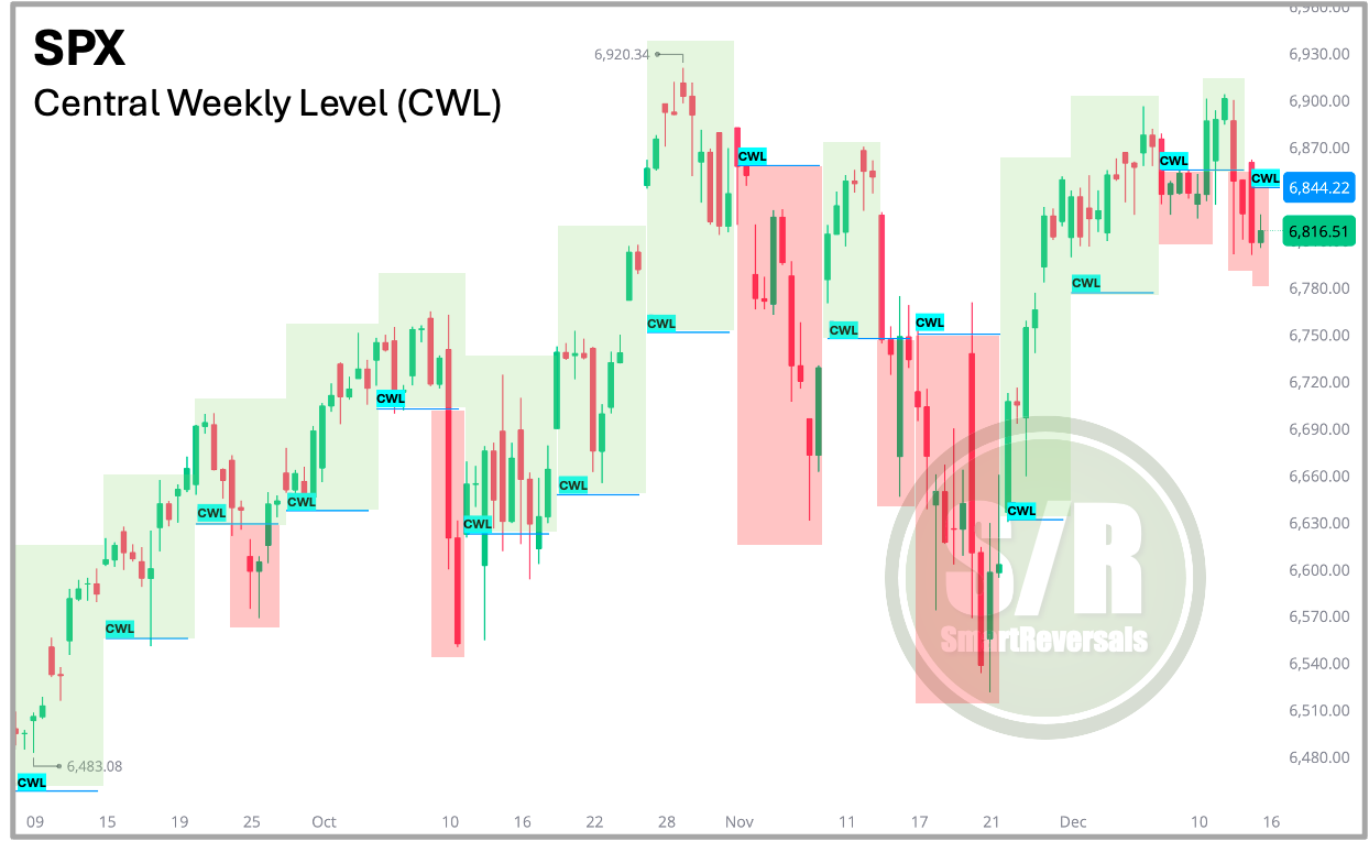
The Early Warning System: Central Weekly Level (CWL) Waiting for a Monthly Level or a 20 day Moving Average to break can sometimes mean reacting too late. To get a faster signal, I use the Central Weekly Level (CWL).
Updated every Friday, this level gives paid subscribers an immediate reference point for the week ahead. It is the ultimate filter for timing: if an overbought stock drops below the CWL, it provides references that a pullback is starting. Conversely, if a stock reclaims the CWL, it provides validation that a bounce is real. This publication consistently analyzes the following securities:
Indices & Futures: SPX, NDX, DJI, IWM, ES=F, NQ=F
ETFs: SPY, QQQ, SMH, TLT, GLD, SLV, DIA, SH, PSQ
Major Stocks: AAPL, MSFT, GOOG, AMZN, NVDA, META, TSLA, BRK.B, LLY, WMT, AVGO, COST, JPM, PLTR, NFLX
Crypto & Related: Bitcoin, ETH, IBIT, MSTR
Leveraged ETFs: TQQQ, SQQQ, UDOW, SDOW, UPRO, SPXS, URTY, SRTY
Premium subscribers can suggest their favorite stocks for a modeling of their Support and Resistance Levels, that customized modeling is posted on Sundays afternoon (New York Time).
Unsure which indicators apply best to your specific stock? I handle that analysis for you, identifying the exact tools that explain current price action and targets. Unlock the latest Weekly Compass to access high-probability setups. Premium subscribers received bullish signals for LLY (+3.38% today) and BRK.B (+1.37% today) just last Saturday. We also cover the short side, with bearish setups like IWM (-0.76%) already playing out.
Crucially, I also manage risk. When a setup invalidates, as seen with NFLX today, the Central Weekly Level (CWL) serves as a precise technical reference for a stop loss (you set the stop based on your risk aversion or conviction).
Whether you are balancing a 9-5 job or trading full-time, these pre-planned high probability trades allow you to execute decisions with confidence.
The high probability setups can be read here:
The full set of S/R levels for this week can be read here:
If you found this guide helpful, please Like and Repost for more free articles like this one! Next could be TSLA or BITCOIN (Yes, they respect indicators more than you think).
And the modeled S/R levels for securities suggested by premium subscribers can be reached here: ORCL, IREN, VXX, HOOD, TSM, and over 60 were modeled listening to you.
The content provided on SmartReveals.com is for educational and informational purposes only. All analyses, research, commentary, and other materials are intended to help users understand financial markets, investment concepts, and company fundamentals. This content does not constitute investment or any type of advice. The support and resistance levels are modeled references to manage risk and anticipate potential reversals, each investor must assess their own risk tolerance to set stops.
My only communication channel with you is via email, and the Substack chat, I don’t use Telegram, WhatsApp, Discord, Private Channels, or any other communication method.


